BrightZen OS
Centralizing financial service operations and making data workflows manageable through an application interface.
- My role
- Solutions Architect & AI Solutions Architect
- Status
- Actively used by the internal team
- Categories
- Operations Automation · Data & Decision Intelligence
Outcome
Actively used by the team, with improved efficiency and scalability through centralized workflows and easier management of recurring data tasks.
Business context
BrightZen OS supports a family-office and accounting-services setting in which teams oversee multiple businesses. Beyond portfolio-company financial visibility, the operational foundation — integrations, synchronization, data tasks, and client communication — previously ran through code and spreadsheets.
The challenge
The business relied on spreadsheets and a distributed collection of tools. Integrations were managed in the backend, team members used code to configure data tasks, and information flowed through Google spreadsheets.
The goal: an operating system for the business with accessible integration management, data visibility, and a better client-facing experience.
My role
I served as Solutions Architect and AI Solutions Architect, working directly with the owner on business needs, the solution plan, and priorities. I structured the work with my engineers and kept the owner involved through regular progress updates and delivered outputs.
How the workflow changes
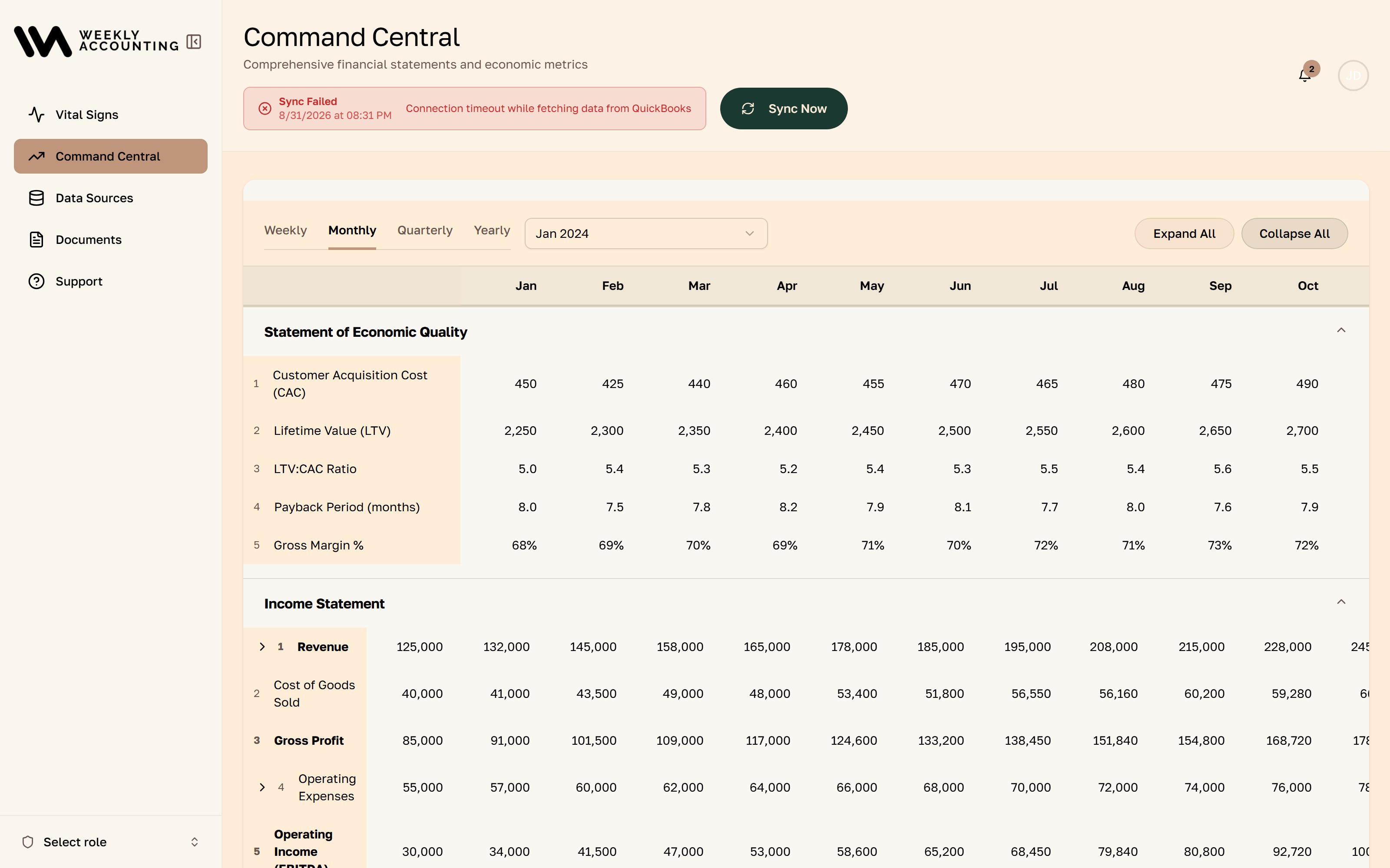
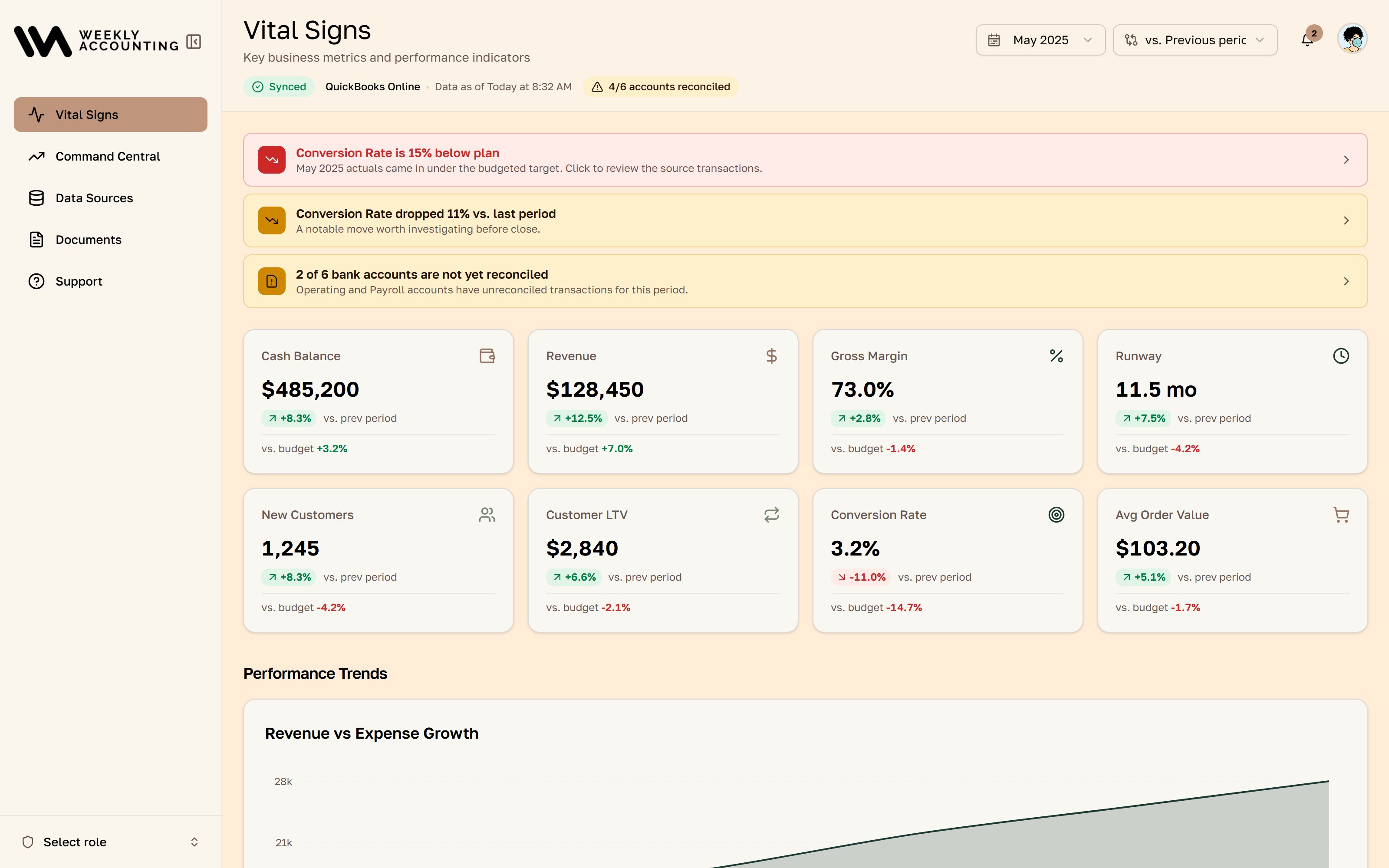
The team manages connections in the application, checks when data synchronized, and configures recurring data tasks through the interface. Fractional CFOs and bookkeepers can see whether information is current before using it. The client portal creates a dedicated place for the customer experience, replacing a Google spreadsheet as the central interface.
Product experience and design
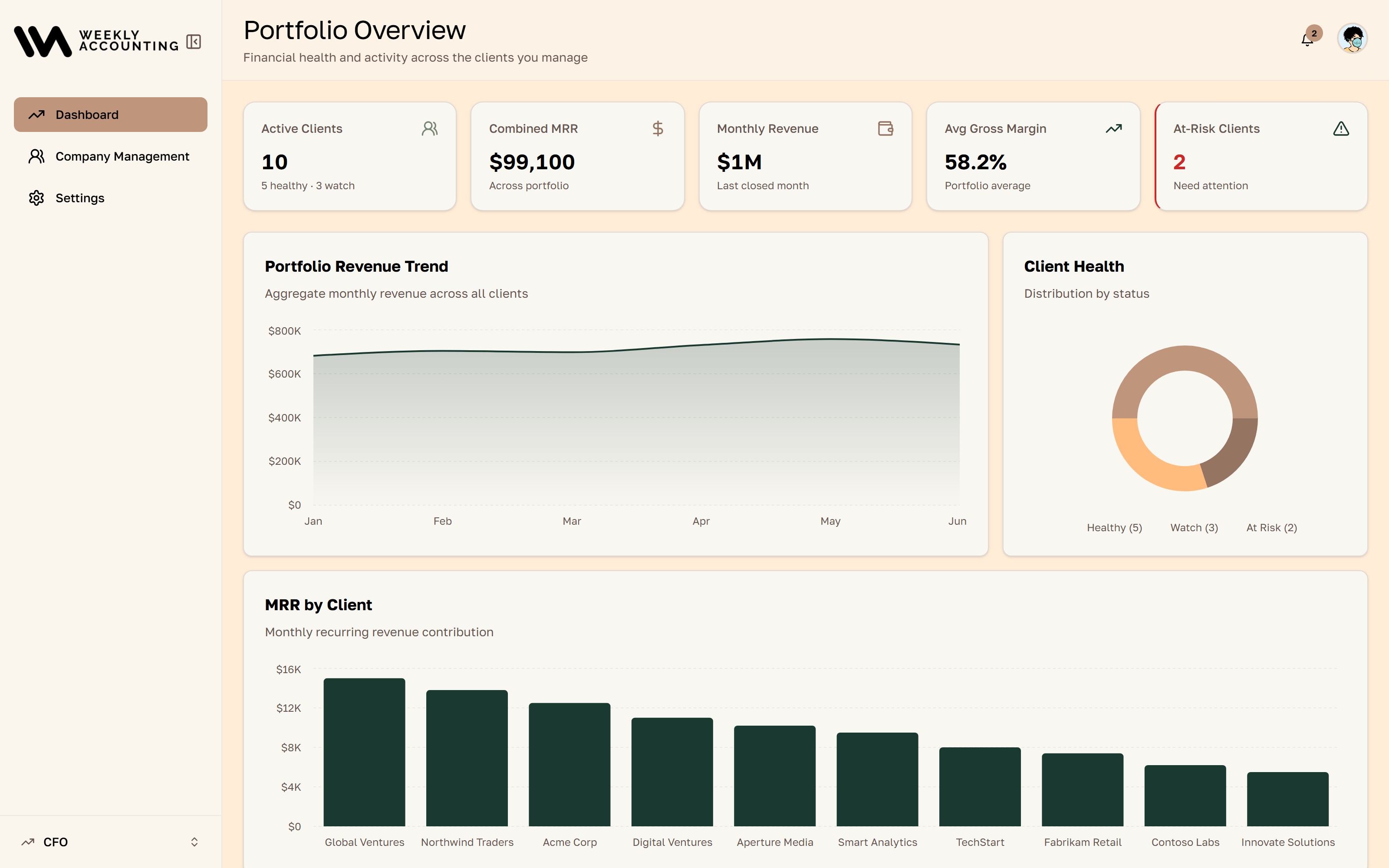
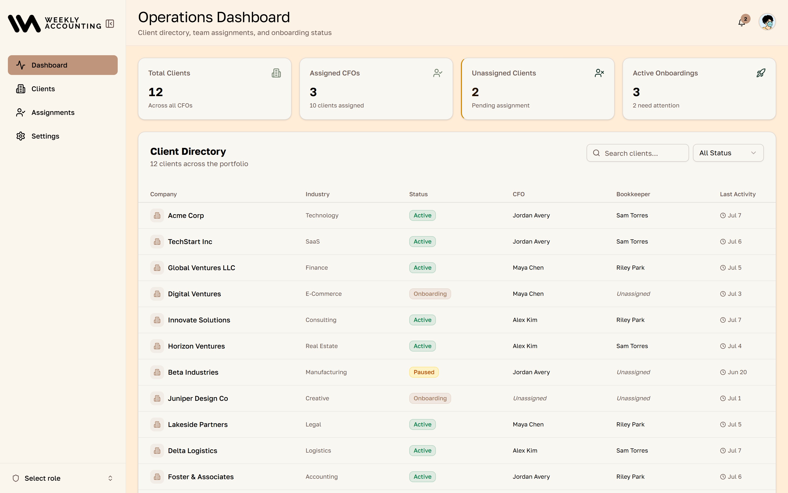
The product separates platform administrators, tenants, and companies, with reusable financial screens serving multiple audiences. Tenant branding changes selected color tokens while common surfaces and structure stay consistent — the screenshots show a Weekly Accounting tenant.
Architecture and implementation
Shared UI packages and a multi-tenant data model. A documented color-token naming change avoids collisions between app and component-library styling. The stack combines a Next.js interface with a NestJS API, PostgreSQL, and background job services.
Delivery approach
I worked with the business owner to turn a fragmented operating process into a usable system. The result is not simply a financial dashboard: operational controls moved out of backend code and into the application.
Results and current status
The team actively uses BrightZen OS, with improved efficiency and scalability through centralized workflows and easier management of recurring data tasks.
Palette
Brand primary
#42307D
Violet — tenant-overridable
Brand secondary
#FFE169
Tenant-overridable
Brand accent
#A853BA
Tenant-overridable
Heading
#0A192F
Fixed across tenants
Container
#FFFDF3
Warm surface
Border
#E2E8FD
Cool hairline
Scope
Published snapshot of the codebase — useful technical context, not a measure of customer impact.
- Screens
- 58
- Shared UI components
- 47
- API files
- 929
- DB schemas
- 50
- Migrations
- 72
- Tests
- 671
Screens
Solution and scope
- A centralized web application for managing integrations and connections
- A client portal replacing the spreadsheet-based client experience
- Sync visibility for fractional CFOs and bookkeepers — what updated, and when
- Data tasks configurable through the interface instead of backend code changes
Built with
- Next.js 16
- React 19
- Tailwind 4
- TanStack Query
- Turborepo
- NestJS 11
- Drizzle ORM
- Postgres
- Supabase
- Redis
- BullMQ
- Nix