Marketplace Ops
An integrated research and analytics application that turns scattered marketplace data into product insights, recommendations, and briefs.
- My role
- Solutions Architect & AI Solutions Architect
- Status
- Live and actively used
- Categories
- Data & Decision Intelligence · AI Agents & Assistants
Outcome
Daily spreadsheet consolidation that took hours now completes in seconds. Answers, analysis, and a product brief can be produced in minutes.
Business context
Marketplace Ops helps brands operate and grow on marketplaces such as Amazon and Walmart, and runs its own portfolio of Amazon brands. Its work spans advertising, listings, search optimization, inventory, supply chain, customer service, and analytics. That breadth made a dependable research and performance system valuable to both internal brand decisions and client work.
The challenge
The team exported files from different platforms, checked multiple applications, and manually entered results into spreadsheets built around its own formulas. Product research, market intelligence, and analysis of existing products depended on hours of daily data consolidation.
The goal: centralize the information, preserve the business logic behind the research, and help the owner identify opportunities and understand product performance.
My role
I served as Solutions Architect and AI Solutions Architect, working directly with the owner on business needs, the solution plan, and priorities. I structured the work with my engineers and kept the owner involved through regular progress updates and delivered outputs.
Assembled Systems provided product management, design, development, and QA.
How the workflow changes
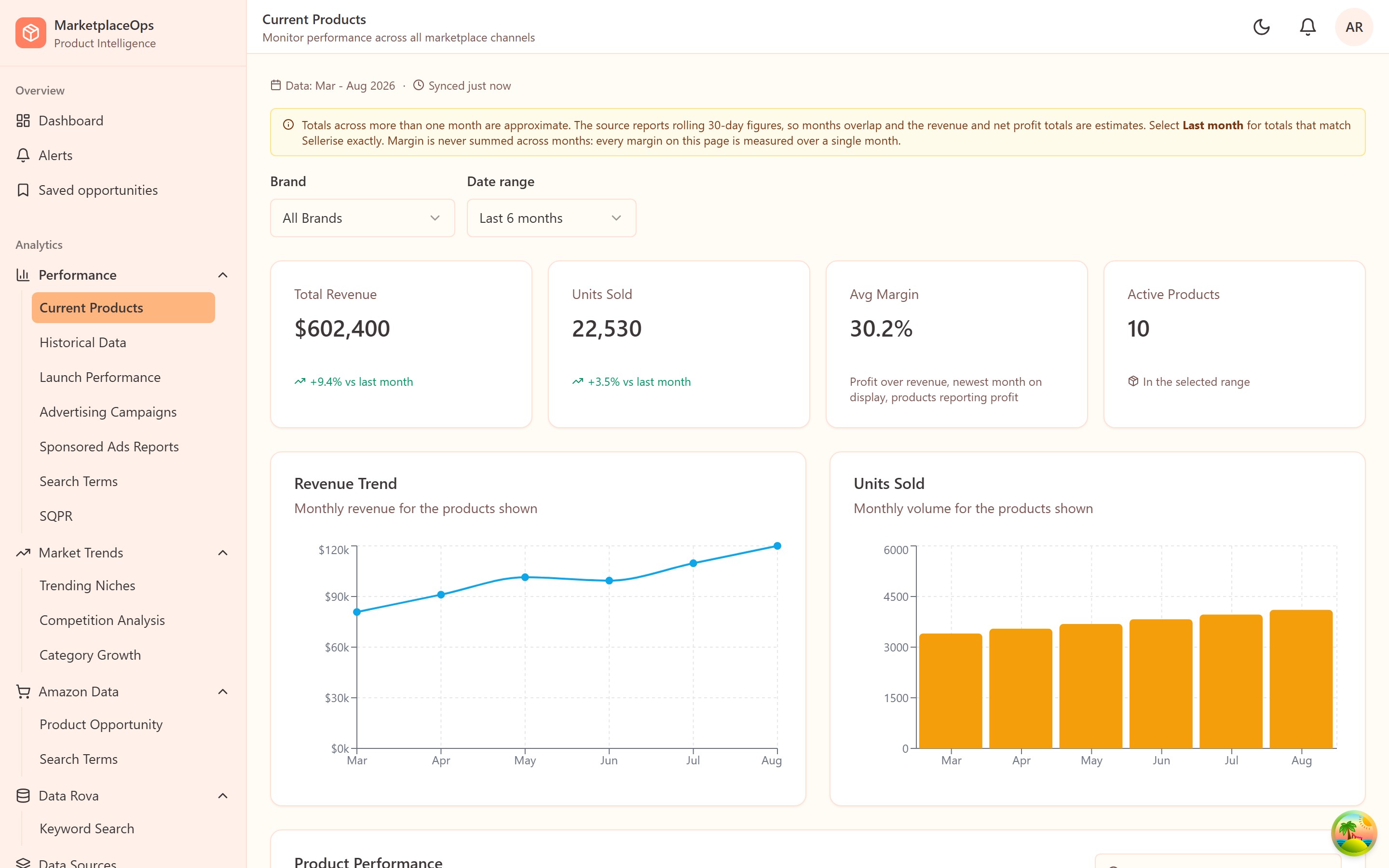
A scheduled process collects data from the connected sources. The team reviews existing product performance or investigates a new opportunity, narrows its research, and uses chat to ask follow-up questions. The resulting analysis can be assembled into a product brief rather than reconstructed from several spreadsheets.
The owner can move from information retrieval to a recommendation within the same application.
Product experience and design
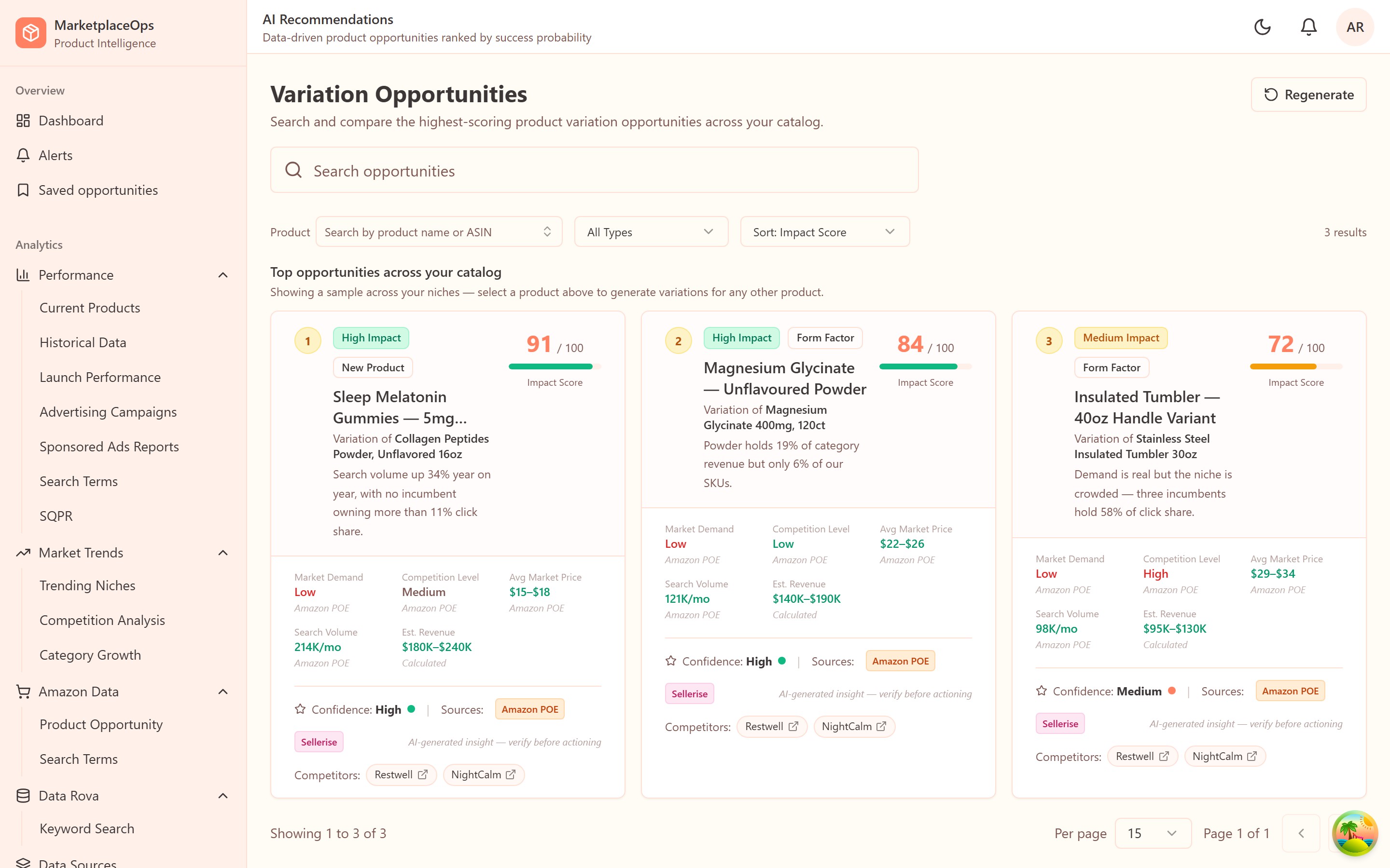
A decision-first interface: products receive an assessment, with evidence available underneath. Watchlists, alerts, and history help focus attention. Coral and warm neutral surfaces provide visual consistency; chart colors and status colors have distinct jobs.
Architecture and implementation
Eight scrapers, background jobs, and Redis keep collection separate from page interaction. Claude supports classification and research, alongside browser automation and a RAG data layer. Invite-based access, permissions, audit records, and a multi-tenant structure support controlled internal use.
Delivery approach
A dedicated development partnership covering product management, QA, application design, and engineering. The central value is sustained ownership of the data-to-decision workflow: source collection, structured data, usable analysis, and AI assistance. Regular discussions with the owner connected the research methods the business already used to the new application.
Results and current status
The system is actively used. Daily spreadsheet consolidation that previously took hours now completes in seconds through scheduled automation. Answers, analysis, and a product brief can be produced in minutes.
Palette
Primary
#FF8162
Coral — actions and alerts
Accent
#FFB57E
Secondary emphasis
Background
#FFFBF5
Warm cream, not white
Surface
#FFF1EA
Sidebar and muted panels
Foreground
#3D3637
Warm near-black
Success
#16A249
Reserved for state only
Scope
Published snapshot of the codebase — useful technical context, not a measure of customer impact.
- Screens
- 49
- Components
- 79
- Data models
- 38
- API controllers
- 34
- Scrapers
- 8
- Tests
- 142
Screens
Solution and scope
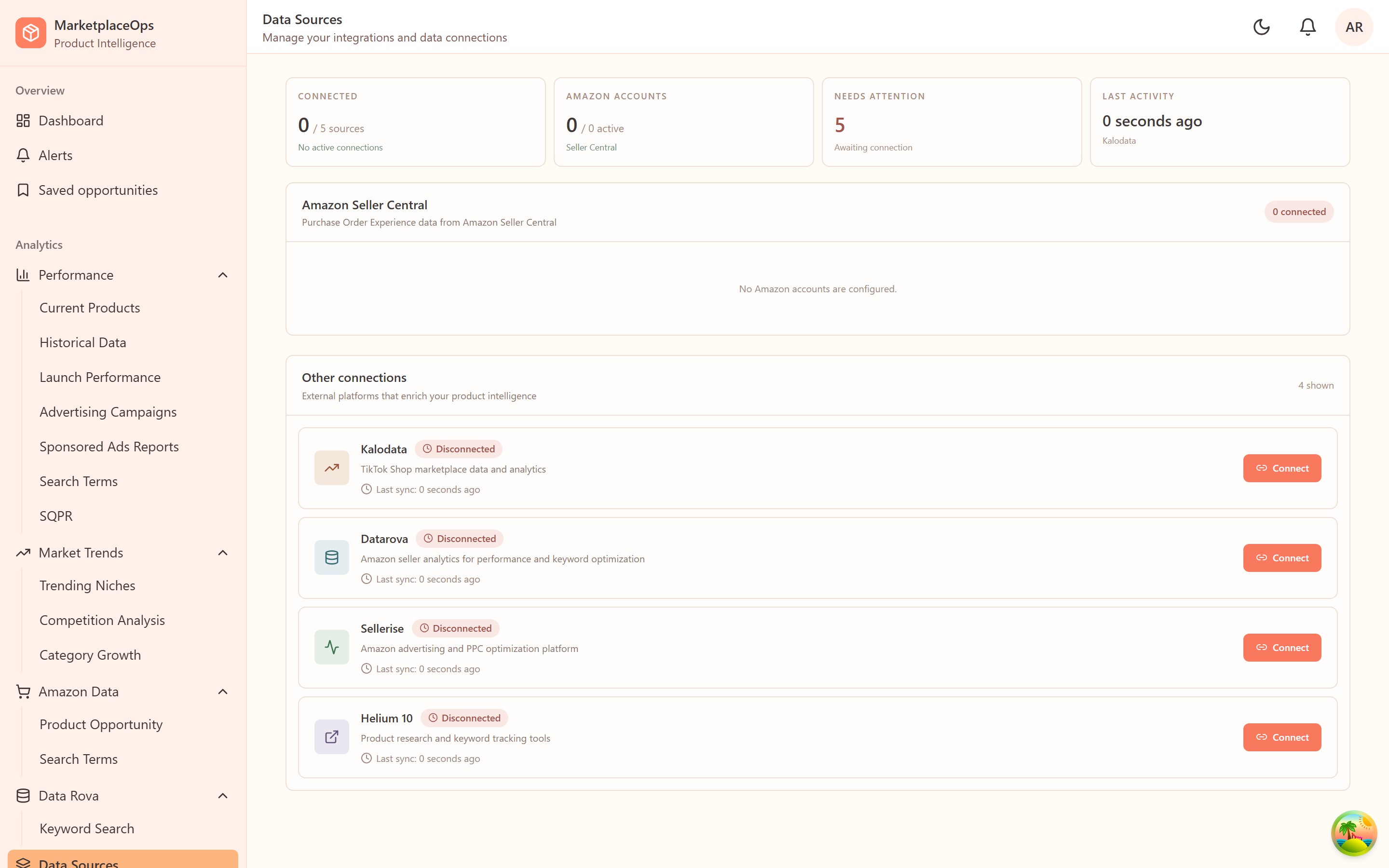
- Connected five or more data sources, including Amazon and TikTok, in one web application
- Dashboards for competitive research, keyword research, and existing product performance
- Browser automation, AI, and data retrieval for scheduled collection and analysis
- Generative AI chat for business-data questions, product recommendations, and product briefs
Built with
- React
- TypeScript
- Vite
- Tailwind
- Radix UI
- TanStack Query
- Recharts
- Node.js
- Express
- MongoDB
- Redis
- BullMQ
- Playwright
- Claude
- Docker