
Gift Genie
Reworking a gift-buying application around a contextual, conversational AI shopping assistant.
- My role
- Solutions Architect & AI Solutions Architect
- Status
- Updated experience in development
- Categories
- AI Agents & Assistants · Product Development & Scale
Outcome
Established a new conversational direction, with improvements to the application and its AI backend. The revised product remains in development.
In development — parts of this product have not shipped yet.
Business context
Gift Genie is a consumer iOS gifting application. The product concept includes keeping track of recipients and occasions, suggesting gifts by budget, and supporting physical greeting cards. The founder's need was broader than adding screens: he wanted a useful experience people would engage with, and a more affordable way to keep improving it.
The challenge
Gift Genie was already on the App Store, but downloads and engagement were low. The application was unfinished, the founder was struggling with the user experience, and additional features were needed.
The goal: improve the shopping experience and make progress at an affordable cost through AI-powered development.
My role
I served as Solutions Architect and AI Solutions Architect, working directly with the owner on business needs, the solution plan, and priorities. I structured the work with my engineers and kept the owner involved through regular progress updates and delivered outputs.
How the workflow changes
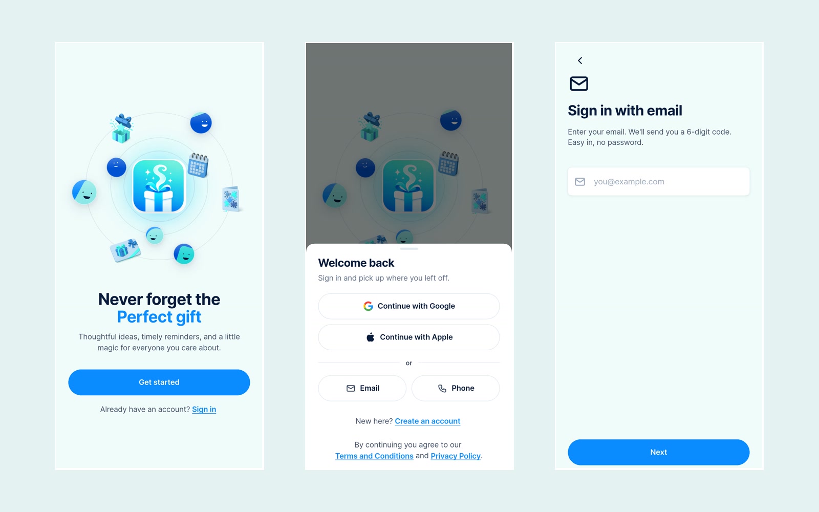
The intended experience starts with the people a user buys for, important dates, and shopping needs. A conversational assistant helps the user explore options and refine a recommendation. Our development focus was the context behind that exchange, so the assistant could behave more like a personal shopping helper.
Product experience and design
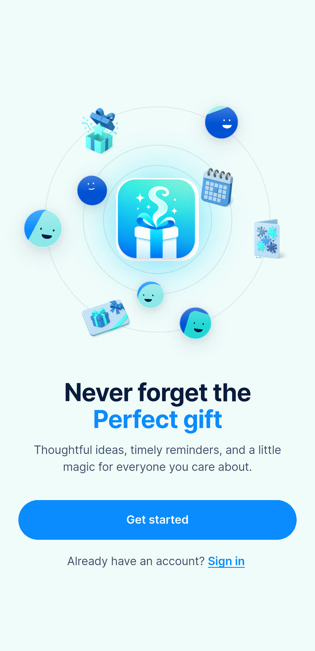
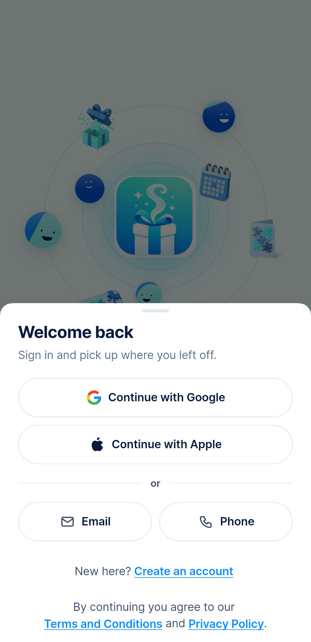
Standardized chips, buttons, and headings address inconsistent styling. Cool colors carry structure and actions, while warm accents mark celebration. Accessibility targets include 44px tap areas, readable contrast, and support for larger text. Onboarding uses short steps and an email code.
Architecture and implementation
The mobile architecture separates gifting, reminders, occasions, cards, and billing into modules. Flutter and Dart provide the app, Firebase and Cloud Functions support backend behavior, and RevenueCat handles subscription billing.
Delivery approach
I worked directly with the founder on product direction and brought design, user experience, new capabilities, and AI backend work into one plan. The shift toward an agentic chat experience is the core of the transformation. The App Store listing belongs to the earlier application — the revised version has not launched yet.
Results and current status
The revised product remains in development. The work has established a new conversational direction and improvements to the application and AI backend.
Palette
Bright blue
#0A8BFF
Every control — action and selection
Deep blue
#14264D
Structure and dark surfaces
Pale aqua
#F0FBFB
One app-wide wash
Error text
#D9483A
Coral is too light to read as text
Scope
Published snapshot of the codebase — useful technical context, not a measure of customer impact.
- Feature modules
- 23
- Design system doc
- 1,963 lines
- Backend functions
- 63
- Minimum tap target
- 44px
Screens

Solution and scope
- Product design and user experience improvements
- New functions and capabilities, shifting toward a chat-led shopping experience
- AI chat backend that understands context and gives more useful shopping support
- Shaped the product around a personal assistant rather than isolated gift-selection screens
Built with
- Flutter
- Dart
- Material 3
- Firebase
- Cloud Functions
- RevenueCat