Certainly CX
Creating AI service offerings that help a customer support agency measure quality, assist human agents, and handle phone conversations.
- My role
- Solutions Architect & AI Solutions Architect
- Status
- QA product launched and sold; ongoing system support
- Categories
- AI Agents & Assistants · Data & Decision Intelligence
Outcome
The AI quality assurance product secured its first customer within the first month after launch.
Business context
Certainly CX is a customer service agency supporting other businesses. It wanted to sell new AI capabilities alongside its services — accelerating its roadmap, reducing development costs, and supplementing its existing engineers with a team focused on three new offerings.
The challenge
Certainly CX wanted to introduce AI products it could sell alongside its services, including a way to evaluate agent interactions and identify coaching needs.
The goal: create commercially useful AI capabilities that improve support delivery and provide new offerings for clients.
My role
I served as Solutions Architect and AI Solutions Architect, working directly with the owner on business needs, the solution plan, and priorities. I structured the work with my engineers and kept the owner involved through regular progress updates and delivered outputs.
The team provided product management, design, architecture oversight, and development alongside the client's existing engineering resources.
How the workflow changes
For QA, a support conversation or call enters the system, is evaluated against a quality framework, and becomes a score with coaching opportunities. Leaders review quality trends and decide where agents need help.
The copilot supports the agent during ticket handling, while the voice offering addresses phone interactions. Together, these cover evaluation, assistance, and conversational automation.
Product experience and design
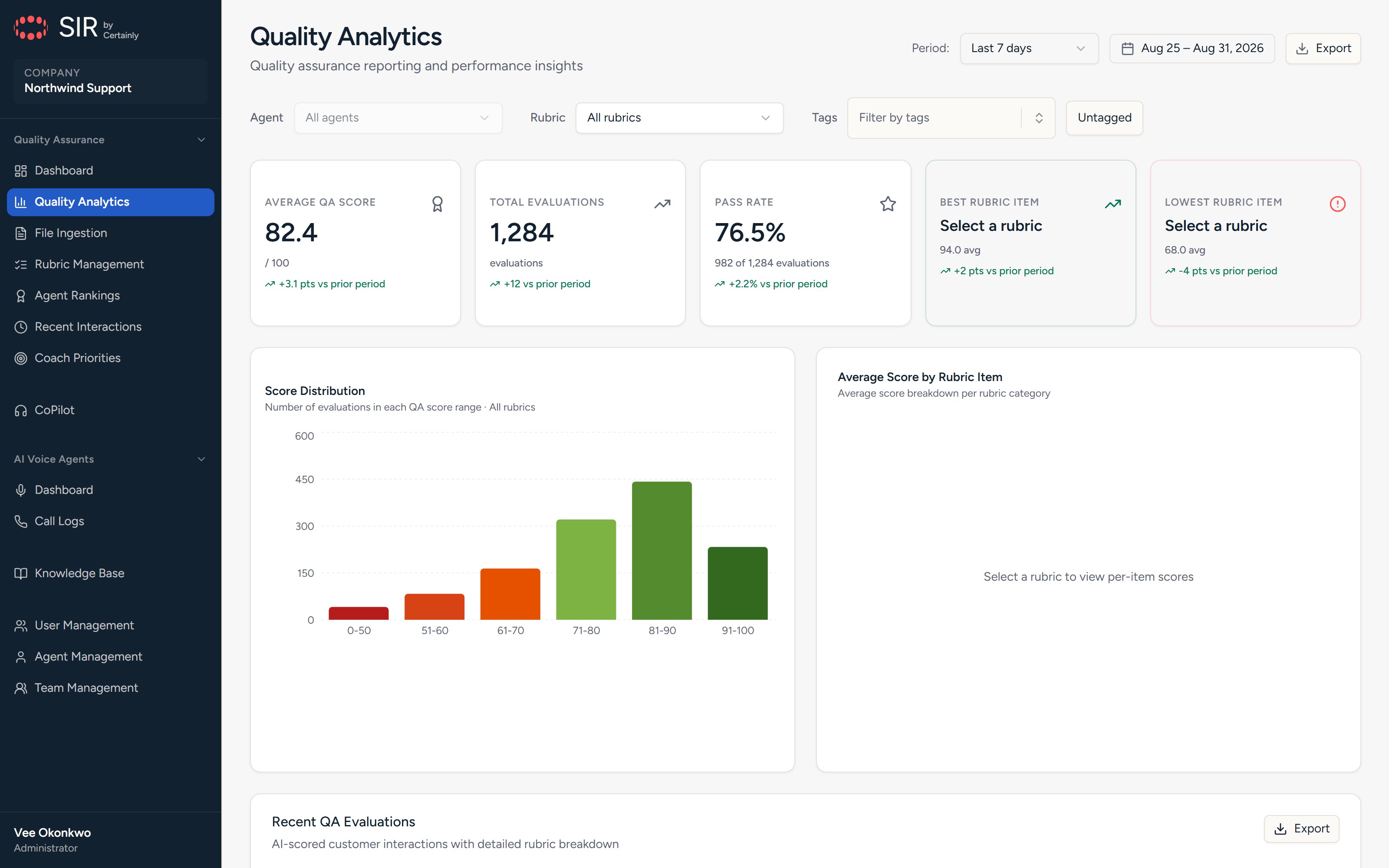
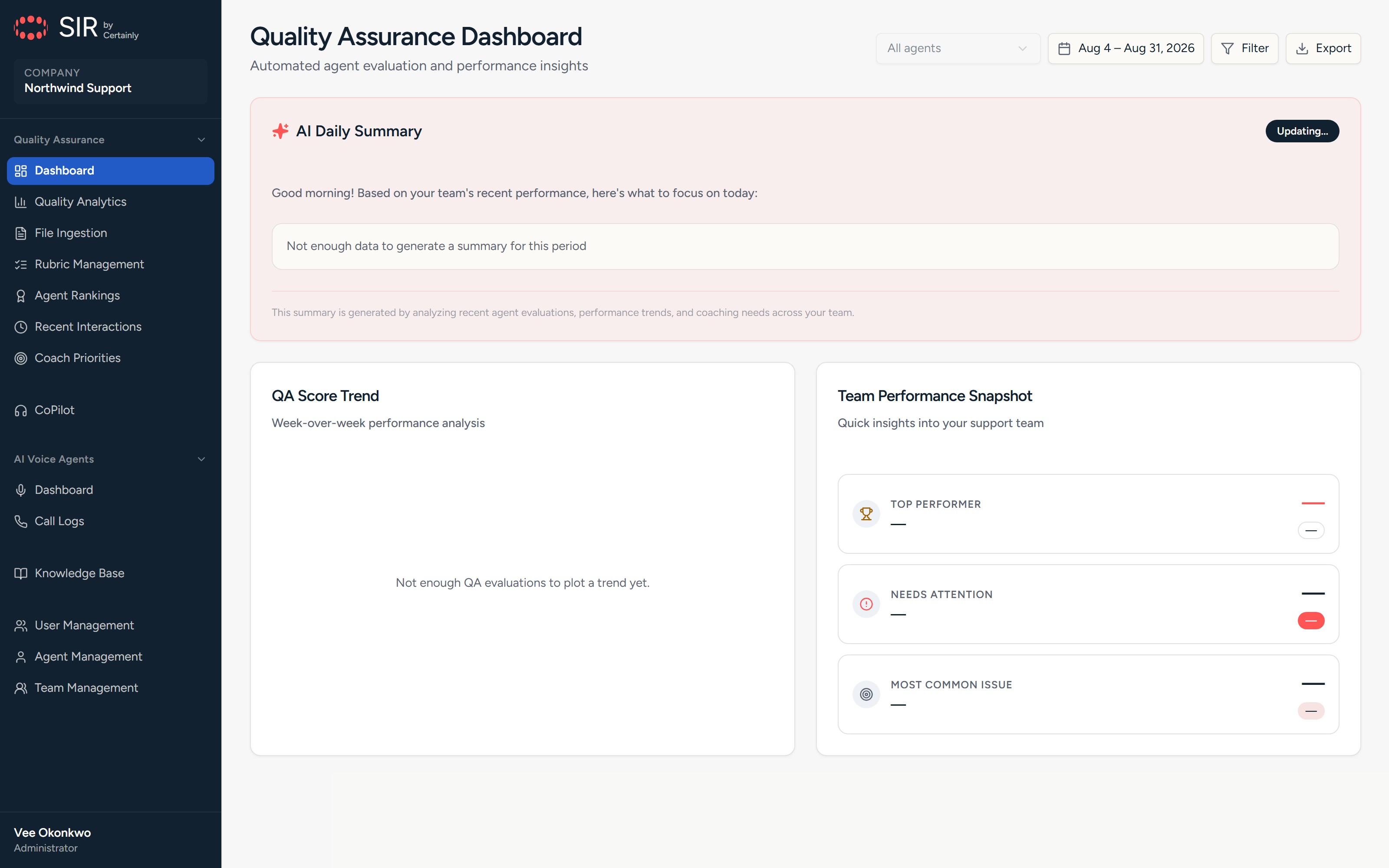
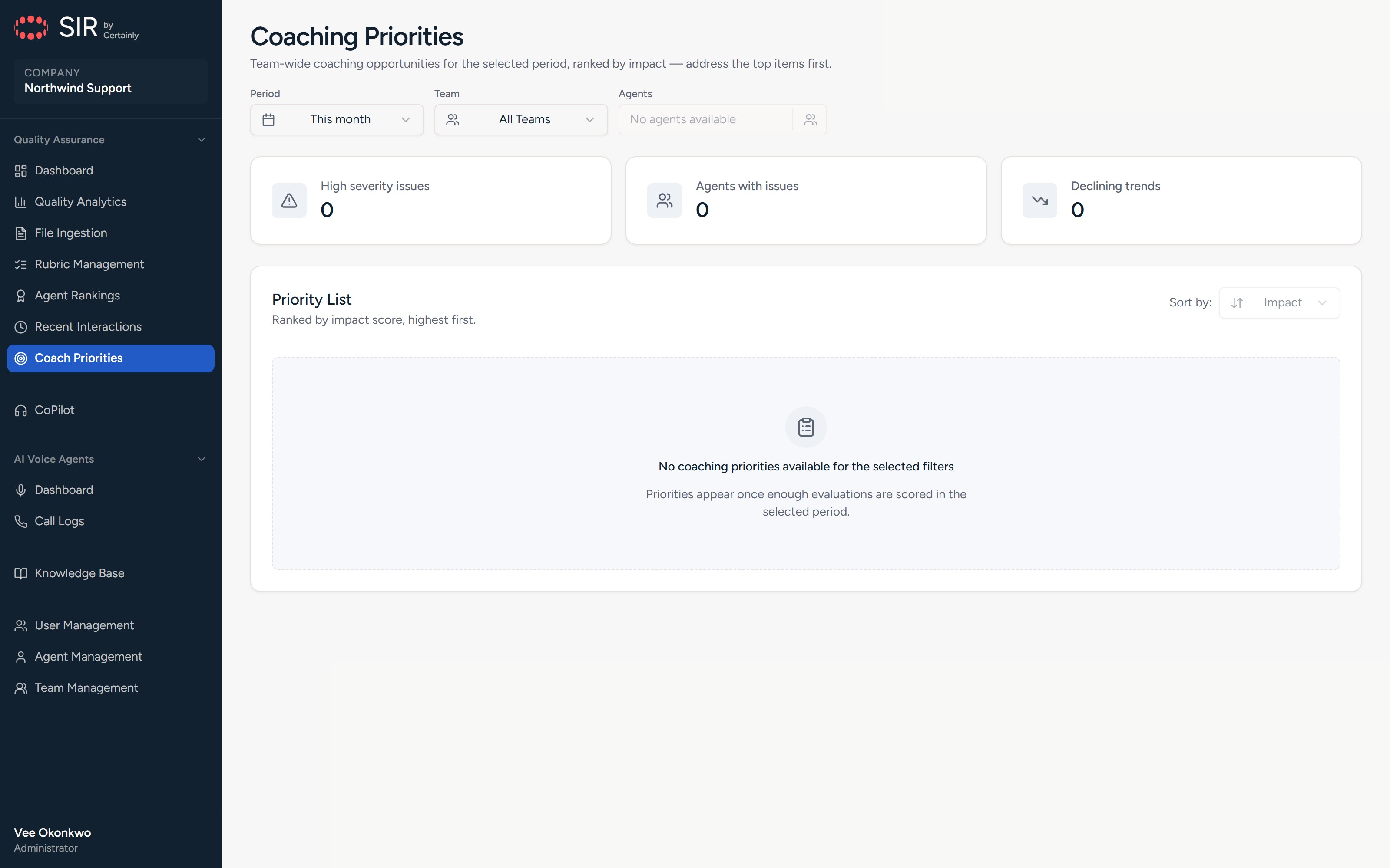
Analytics, coaching priorities, and AI-written daily summaries, in a layout built for wide tables and charts. Design work included more legible success and warning colors, correction of a chart-color collision, and visual regression coverage for page structure.
Architecture and implementation
The QA workflow spans a dashboard, NestJS API, Python scoring service, and Chrome side panel. It queues conversations, redacts personal information before model scoring, and returns results through authenticated callbacks. A multi-tenant structure supports separate customer organizations.
Delivery approach
Assembled Systems contributed design, product management, architecture oversight, and engineering alongside the existing team — a faster, lower-cost development approach than building the offerings in-house.
Results and current status
The quality assurance product secured its first customer within the first month after launch. Assembled Systems continues maintaining and managing systems for existing users.
Palette
Navy
#112130
Sidebar and text
Blue
#225BC6
Primary and info
Red
#FF5655
Brand accent, destructive
Off-white
#FCFAF7
Page ground
Success
#047857
Emerald-700 for legible contrast
Warning
#A16207
Amber-700 for legible contrast
Scope
Published snapshot of the codebase — useful technical context, not a measure of customer impact.
- Screens
- 32
- UI components
- 456
- API modules
- 40
- Data schemas
- 31
- Tests
- 632
- Applications
- 4
Screens
Solution and scope
- AI quality assurance that reviews calls and email, scores quality, and identifies coaching opportunities
- A browser-based support copilot that drafts responses across Zendesk, Salesforce, and HubSpot
- An AI voice agent offering for conversational phone responses and actions
Built with
- Next.js 16
- React 19
- Tailwind 4
- Redux Toolkit
- SWR
- NestJS 11
- MongoDB
- Redis
- BullMQ
- Python
- FastAPI
- Presidio
- OpenAI
- Chrome MV3
- Playwright